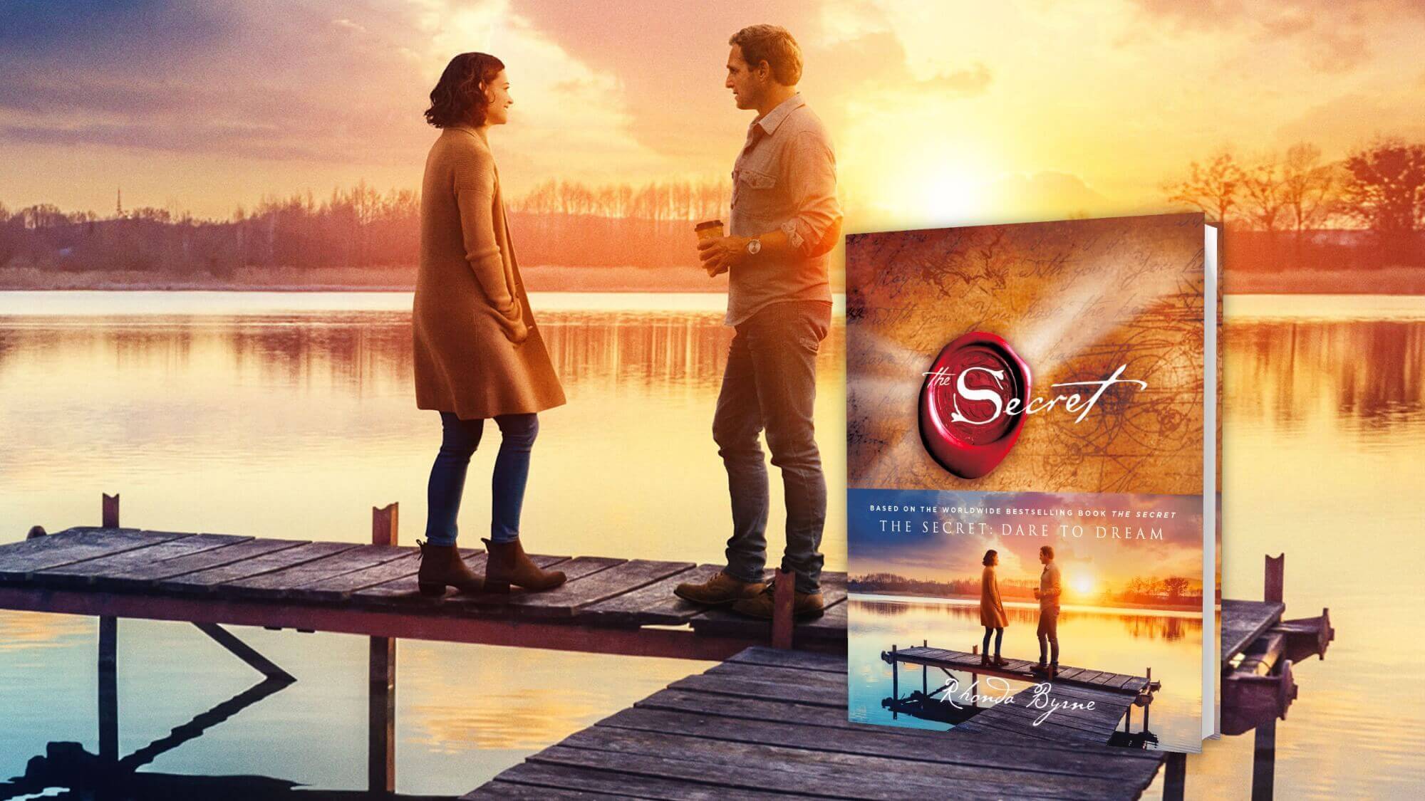
The Client: Rhonda Byrne, author of The Secret
The Secret, a book written by Rhonda Byrne, took the world by storm. To date the series has sold over 30 million copies in print, has been translated into over 52 languages, and has produced 4 New York Times Bestsellers. The contributors include the iconic leaders in the Law of Attraction: Jack Canfield (Chicken Soup for the Soul), Michael Bernard Beckwith (founder of Agape Church), and more.
In 2020, a beautiful featured film The Secret: Dare to Dream starring Katie Holmes and Josh Lucas would premiere to the world.
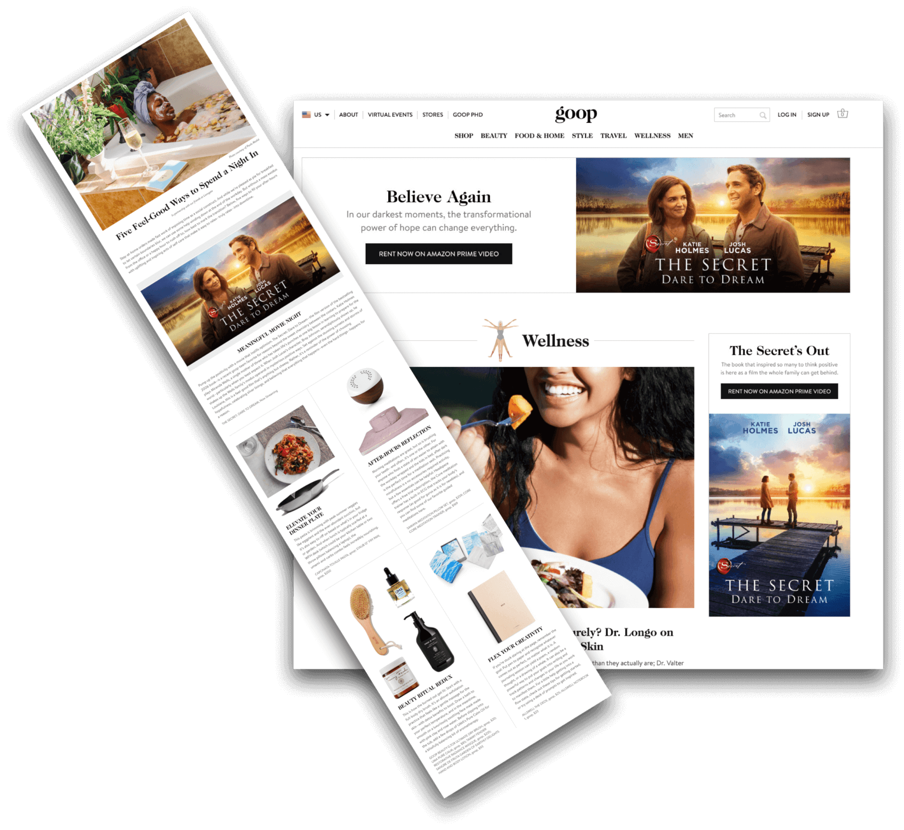
Greta Rose Agency was hired by Roadside Attractions and Lionsgate Entertainment to assist with social engagement and SEO strategy, specifically to help the film connect with the US Body Mind Spirit audiences (BMS). Lionsgate would distribute this beautiful film via video on demand, and Greta Rose Agency would support the organic engagement within the BMS community. We would work closely with our dear friends, 360˚ Communications, to prepare a powerful outreach strategy designed to increase awareness, ultimately drive ticket sales and secure positive BMS media and press coverage.
Simultaneously, Greta Rose Agency was directly by author Rhonda Byrne and The Secret team to support the book. We saw a clear opportunity with the buzz around the film to (1) strengthen existing audiences, (2) introduce The Secret to new audiences, and (3) increase conversion to book sales.
I went about the delicious task of designing a new customer experience via a new website, bringing The Secret to LIFE in a unique and impactful way.
Partnership with goop + Lionsgate
goop, created by Gwyneth Paltrow, was the first and most obvious partnership. Greta Rose Agency had worked closely with goop with other lovely brands, and it was my delight to introduce Lionsgate to this collaborative and creative way of promoting the film. Both goop and Greta Rose Agency think out of the box, so this was a lot of fun.
The Challenge: Infuse the Energy of The Secret Throughout The Website
My first impression of the old website was that if felt stagnant. Anyone who has read The Secret knows that ENERGY and VITALITY is at the core. I immediately felt compelled to create a site that would embody energy, would welcome the visitor to ENGAGE and dive in. I wanted this to feel fluid, alive, deeply emotional.
The old website put the spotlight on The Secret’s accomplishments. It was very “me-centric.” The new website would shift the spotlight onto the visitor. Every page was designed with YOU in mind. We drew customer journeys for each of our Ideal Customer Avatars, and interwove these journeys so that each page would satisfy harmoniously in concert.
If you hover your mouse on the stars, you’ll see they are interactive. Go ahead, play!
Solution: Embrace The Process
There were two themes which seemed at battle with each other: The rich historic parchment paper with famous red wax seal… and the massive universe of stars and planets.
These seemed to clash on the old site, bumping into each other. So, I went about finding the place where these could blend and marry into one another. To my delight, this proved very successful. By bringing out the golden hues from the stars and planets, and lightening up the blues of the skies, the parchment anchored the universe with perfect stature. Everything fell into place.
Initially, first designs included a fun watercolor theme…. but this leaned a little too feminine. The Secret needed to strike a balance of masculine and feminine. Rhonda would remind me that a “truck driver needed to feel as at home on the website as a yoga instructor.” Yin and yang, left and right, hand in hand.
We chipped away at design until we found the perfect balance. It would still be warm, rich, refined, but universal.
My job is to blend seamlessly into the existing company culture. I observe how a team thrives, and I gently introduce new ideas where I see opportunity for improvement. The Secret team values equality. They respect each member’s voice, and every decision reflects a thoughtful and complete resolution. I honored this process and thoroughly enjoyed engaging with each team member to arrive at final approval.
Here’s where we ended up!
What Else?
The next exciting phase for this project is to refine the customer journeys, to create complete Ideal Customer Avatars, and prepare a 6-month media plan for content creation. We will let the website saturate in the world for a few months, and then we will dive into measuring data, specifically comparing old and new website traffic. We expect to see a decrease in bounce rate, increase in session duration, increase in social audiences and subscribers, and a measurable increase in sales. The data will let us know how the new website performs, and we will begin the fun task of putting the site to work!